Team section
Lorem ipsum dolor sit amet, consectetur adipiscing elit. Suspendisse tincidunt sagittis eros. Quisque quis euismod lorem.

Full name
Job title
Lorem ipsum dolor sit amet, consectetur adipiscing elit. Suspendisse varius enim in eros elementum tristique.
Full name
Job title
Lorem ipsum dolor sit amet, consectetur adipiscing elit. Suspendisse varius enim in eros elementum tristique.
Full name
Job title
Lorem ipsum dolor sit amet, consectetur adipiscing elit. Suspendisse varius enim in eros elementum tristique.
Team section
Lorem ipsum dolor sit amet, consectetur adipiscing elit. Suspendisse tincidunt sagittis eros. Quisque quis euismod lorem.
Full name
Job title
Lorem ipsum dolor sit amet, consectetur adipiscing elit. Suspendisse varius enim in eros elementum tristique.
Full name
Job title
Lorem ipsum dolor sit amet, consectetur adipiscing elit. Suspendisse varius enim in eros elementum tristique.
Full name
Job title
Lorem ipsum dolor sit amet, consectetur adipiscing elit. Suspendisse varius enim in eros elementum tristique.
CREA is a 3-day industrial design event igniting creativity, celebrating talent, and inspiring future designers from our college's product and interaction design departments.
The word “CREA” is born out of the intersection of create + work.
BRAND IDENTITY
MARKETING
SOCIAL MEDIA
IMAGERY
BRAND STRATEGY
CREA 23’
CREA 23’
Contents
01
Brand Mission
The Brand
Brand Values
Brand Attributes
Tone of Voice
02
Story
Logo
Clear Space &
Lock Up
Variations
03
Palette
Colour
Usage Proportion
06
Social Media Icon
Instagram Layouts
Brand Applications
Applications
04
Pairings
Typography
Hierarchy
05
Primary Elements
Elements
Variations
Framing
Iconography
crea
Light
Italic
Italic
Regular
Italic
Medium
Italic
Demibold
Italic
Bold
Italic
Extrabold
TT Firs Neue

Colours
crea
Crea Blue
#115BEA
Blue and hot pink together create a captivating contrast that captures the essence of phygitalization
Blue symbolizes technology, trust, and the digital world. Its calming effect reflects stability, while its association with the digital realm aligns perfectly with our theme.
Hot pink, on the other hand, represents innovation, energy, and a forward-thinking approach. The juxtaposition of these two colors mirrors the harmony between the physical and the digital in our ever-advancing world.
Black
RGB #000000
CMyk
White
RGB #000000
CMyk
Blue
RGB #000000
CMyk
Pink
RGB #000000
CMyk
2 Colour Pairing
crea
The following pairs are to not be used, especially in small text/element size:
Blue background-Black text
Black background - Blue text
3 Colour Pairing
crea
Pink is an accent colour.
crea
THE GRADIENT
ratio
#011AFF
#FC249F
30%
70%
+
The gradient serves as a visual metaphor for the seamless integration of the tangible and the virtual.
In essence, the gradients on display reflect the dynamic fusion of creativity and technology, inviting everyone to explore the limitless horizons of design at the intersection of physical and digital experiences.
primary gradient
9
crea
PATTERN
primary gradient
crea
STORY
x
y
z
+
=
=
=
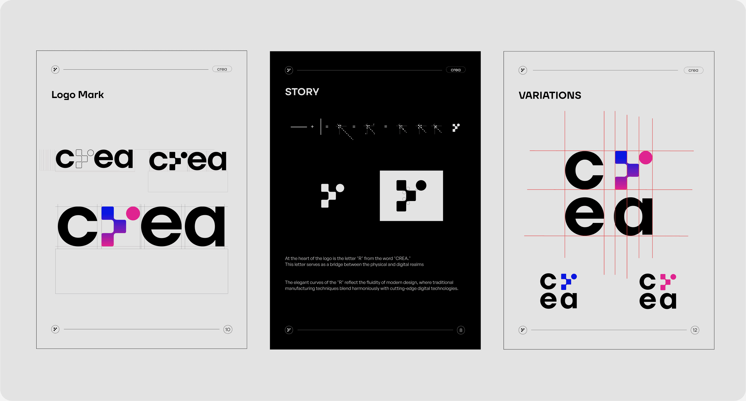
At the heart of the logo is the letter "R" from the word "CREA."
This letter serves as a bridge between the physical and digital realms
The elegant curves of the "R" reflect the fluidity of modern design, where traditional manufacturing techniques blend harmoniously with cutting-edge digital technologies.
8
crea
Logo
c
e
a
7
2
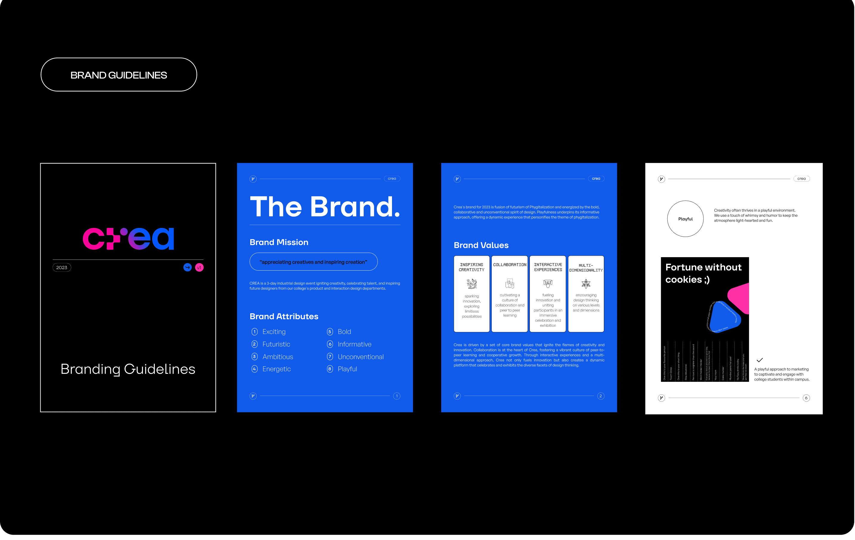
Crea's brand for 2023 is fusion of futurism of Phygitalization and energized by the bold, collaborative and unconventional spirit of design. Playfulness underpins its informative approach, offering a dynamic experience that personifies the theme of phygitalization.
Brand Values
Inspiring
Creativity
sparking innovation, exploring limitless possibilities

Collaboration
cultivating a culture of collaboration and peer to peer learning

Interactive
Experiences
fueling innovation and uniting participants in an immersive celebration and exhibition

Multi-
Dimensionality
encouraging design thinking on various levels and dimensions

Crea is driven by a set of core brand values that ignite the flames of creativity and innovation. Collaboration is at the heart of Crea, fostering a vibrant culture of peer-to-peer learning and cooperative growth. Through interactive experiences and a multi-dimensional approach, Crea not only fuels innovation but also creates a dynamic platform that celebrates and exhibits the diverse facets of design thinking.
3
Contemporary
Informal
Passionate
Inspirational
Playful
Tone of Voice
This year, we are recognizing our tone of voice as a powerful tool to elevate our brand presence and connect deeply with our audience. Our approach is simple yet profound: to speak the language of creativity in ways that resonate with our students .
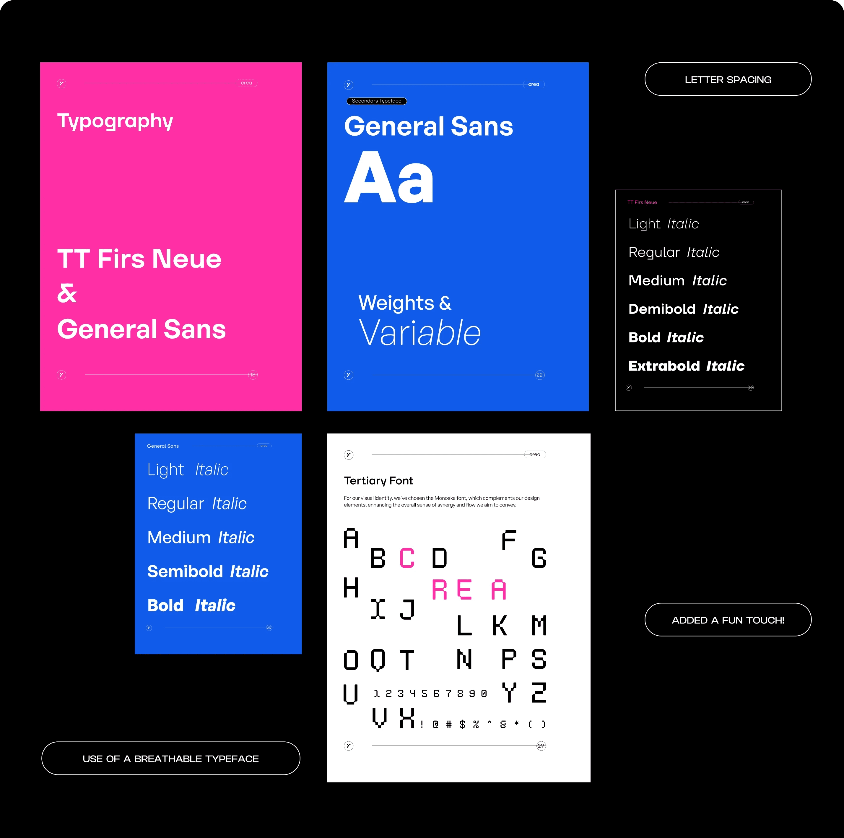
Primary Typeface
TT Firs Neue
19
Variable
Weights &
Typography
18
TT Firs Neue
&
General Sans
Contents
01
Brand Mission
The Brand
Brand Values
Brand Attributes
Tone of Voice
02
Story
Logo
Clear Space &
Lock Up
Variations
03
Palette
Colour
Usage Proportion
06
Social Media Icon
Instagram Layouts
Brand Applications
Applications
04
Pairings
Typography
Hierarchy
05
Primary Elements
Elements
Variations
Framing
Iconography
crea
Light
Italic
Italic
Regular
Italic
Medium
Italic
Demibold
Italic
Bold
Italic
Extrabold
TT Firs Neue
Colours
crea
Crea Blue
#115BEA
Blue and hot pink together create a captivating contrast that captures the essence of phygitalization
Blue symbolizes technology, trust, and the digital world. Its calming effect reflects stability, while its association with the digital realm aligns perfectly with our theme.
Hot pink, on the other hand, represents innovation, energy, and a forward-thinking approach. The juxtaposition of these two colors mirrors the harmony between the physical and the digital in our ever-advancing world.
Black
RGB #000000
CMyk
White
RGB #000000
CMyk
Blue
RGB #000000
CMyk
Pink
RGB #000000
CMyk
2 Colour Pairing
crea
The following pairs are to not be used, especially in small text/element size:
Blue background-Black text
Black background - Blue text
3 Colour Pairing
crea
Pink is an accent colour.
crea
THE GRADIENT
ratio
#011AFF
#FC249F
30%
70%
+
The gradient serves as a visual metaphor for the seamless integration of the tangible and the virtual.
In essence, the gradients on display reflect the dynamic fusion of creativity and technology, inviting everyone to explore the limitless horizons of design at the intersection of physical and digital experiences.
primary gradient
9
crea
PATTERN
primary gradient
crea
STORY
x
y
z
+
=
=
=
At the heart of the logo is the letter "R" from the word "CREA."
This letter serves as a bridge between the physical and digital realms
The elegant curves of the "R" reflect the fluidity of modern design, where traditional manufacturing techniques blend harmoniously with cutting-edge digital technologies.
8
crea
Logo
c
e
a
7
2
Crea's brand for 2023 is fusion of futurism of Phygitalization and energized by the bold, collaborative and unconventional spirit of design. Playfulness underpins its informative approach, offering a dynamic experience that personifies the theme of phygitalization.
Brand Values
Inspiring
Creativity
sparking innovation, exploring limitless possibilities
Collaboration
cultivating a culture of collaboration and peer to peer learning
Interactive
Experiences
fueling innovation and uniting participants in an immersive celebration and exhibition
Multi-
Dimensionality
encouraging design thinking on various levels and dimensions
Crea is driven by a set of core brand values that ignite the flames of creativity and innovation. Collaboration is at the heart of Crea, fostering a vibrant culture of peer-to-peer learning and cooperative growth. Through interactive experiences and a multi-dimensional approach, Crea not only fuels innovation but also creates a dynamic platform that celebrates and exhibits the diverse facets of design thinking.
3
Contemporary
Informal
Passionate
Inspirational
Playful
Tone of Voice
This year, we are recognizing our tone of voice as a powerful tool to elevate our brand presence and connect deeply with our audience. Our approach is simple yet profound: to speak the language of creativity in ways that resonate with our students .
Primary Typeface
TT Firs Neue
19
Variable
Weights &
Typography
18
TT Firs Neue
&
General Sans
Description
BRAND GUIDELINES

Logo Making
Logo Making
About:
Crea's brand for 2023 is fusion of futurism of Phygitalisation and energized by the bold, collaborative and unconventional spirit of design. Playfulness underpins its informative approach, offering a dynamic experience that personifies the theme of phygitalisation.
Crea:
Industrial design exhibition
Graphic team
Project:
Challenge & Solution:
Services i provided:
Challenge:
Charged with reimagining crea'23, we faced the initial challenge of fostering greater student involvement. Our goal was to cultivate a visual identity that not only reflected individuality but also resonated with the theme “Phygitalisation” & diverse interests of the student body across various event touchpoints.
Solution:
We held lively discussions, allowing every team member to contribute their ideas and perspectives In the end, our collective efforts resulted in a design we all felt proud of, reflecting not only our hard work but also the joy we had along the way.

BADGES & ID’s

People behind the project:
The Result:
The Credits:
Project Outcomes:
Crowd’s feedback:
Attendees were captivated by the cohesive blend of colors and fonts, which perfectly captured the essence of the event's theme, "Phygitalisation." the seamless integration of physical and digital elements, remarking on how the design fostered a sense of exploration and discovery.
The Result:
The result? A staggering 80% surge in walk-in attendance, marking a successful transformation of Crea's event experience.

solace
coming soon....
Speak to people like people.

SOLACE
SETU
SOCIAL MEDIA PRESENCE
LOGO DESIGN
DESIGN RESEARCH
USER INTERFACE
USER EXPERIENCE
BRAND STRATEGY
{coming soon....}


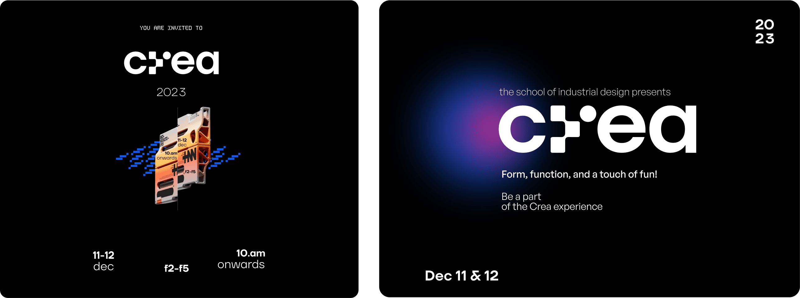
CREA is a 3-day industrial design event igniting creativity, celebrating talent, and inspiring future designers from our college's product and interaction design departments.
The word “CREA” is born out of the intersection of create + work.
CREA 23’
CREA 23’
Contents
01
Brand Mission
The Brand
Brand Values
Brand Attributes
Tone of Voice
02
Story
Logo
Clear Space &
Lock Up
Variations
03
Palette
Colour
Usage Proportion
06
Social Media Icon
Instagram Layouts
Brand Applications
Applications
04
Pairings
Typography
Hierarchy
05
Primary Elements
Elements
Variations
Framing
Iconography
crea
Light
Italic
Italic
Regular
Italic
Medium
Italic
Demibold
Italic
Bold
Italic
Extrabold
TT Firs Neue
Colours
crea
Crea Blue
#115BEA
Blue and hot pink together create a captivating contrast that captures the essence of phygitalization
Blue symbolizes technology, trust, and the digital world. Its calming effect reflects stability, while its association with the digital realm aligns perfectly with our theme.
Hot pink, on the other hand, represents innovation, energy, and a forward-thinking approach. The juxtaposition of these two colors mirrors the harmony between the physical and the digital in our ever-advancing world.
Black
RGB #000000
CMyk
White
RGB #000000
CMyk
Blue
RGB #000000
CMyk
Pink
RGB #000000
CMyk
2 Colour Pairing
crea
The following pairs are to not be used, especially in small text/element size:
Blue background-Black text
Black background - Blue text
3 Colour Pairing
crea
Pink is an accent colour.
crea
THE GRADIENT
ratio
#011AFF
#FC249F
30%
70%
+
The gradient serves as a visual metaphor for the seamless integration of the tangible and the virtual.
In essence, the gradients on display reflect the dynamic fusion of creativity and technology, inviting everyone to explore the limitless horizons of design at the intersection of physical and digital experiences.
primary gradient
9
crea
PATTERN
primary gradient
crea
STORY
x
y
z
+
=
=
=
At the heart of the logo is the letter "R" from the word "CREA."
This letter serves as a bridge between the physical and digital realms
The elegant curves of the "R" reflect the fluidity of modern design, where traditional manufacturing techniques blend harmoniously with cutting-edge digital technologies.
8
crea
Logo
c
e
a
7
2
Crea's brand for 2023 is fusion of futurism of Phygitalization and energized by the bold, collaborative and unconventional spirit of design. Playfulness underpins its informative approach, offering a dynamic experience that personifies the theme of phygitalization.
Brand Values
Inspiring
Creativity
sparking innovation, exploring limitless possibilities
Collaboration
cultivating a culture of collaboration and peer to peer learning
Interactive
Experiences
fueling innovation and uniting participants in an immersive celebration and exhibition
Multi-
Dimensionality
encouraging design thinking on various levels and dimensions
Crea is driven by a set of core brand values that ignite the flames of creativity and innovation. Collaboration is at the heart of Crea, fostering a vibrant culture of peer-to-peer learning and cooperative growth. Through interactive experiences and a multi-dimensional approach, Crea not only fuels innovation but also creates a dynamic platform that celebrates and exhibits the diverse facets of design thinking.
3
Contemporary
Informal
Passionate
Inspirational
Playful
Tone of Voice
This year, we are recognizing our tone of voice as a powerful tool to elevate our brand presence and connect deeply with our audience. Our approach is simple yet profound: to speak the language of creativity in ways that resonate with our students .
Primary Typeface
TT Firs Neue
19
Variable
Weights &
Typography
18
TT Firs Neue
&
General Sans
Description
BRAND IDENTITY
MARKETING
SOCIAL MEDIA
IMAGERY
BRAND STRATEGY
BRAND GUIDELINES
Logo Making
About:
Crea's brand for 2023 is fusion of futurism of Phygitalisation and energized by the bold, collaborative and unconventional spirit of design. Playfulness underpins its informative approach, offering a dynamic experience that personifies the theme of phygitalisation.
Crea:
Industrial design exhibition
Graphic team
Project:
Challenge & Solution:
Services i provided:
Challenge:
Charged with reimagining crea'23, we faced the initial challenge of fostering greater student involvement. Our goal was to cultivate a visual identity that not only reflected individuality but also resonated with the theme “Phygitalisation” & diverse interests of the student body across various event touchpoints.
Solution:
We held lively discussions, allowing every team member to contribute their ideas and perspectives In the end, our collective efforts resulted in a design we all felt proud of, reflecting not only our hard work but also the joy we had along the way.
SETU
SOCIAL MEDIA PRESENCE
LOGO DESIGN
SOLACE
solace
coming soon....
Speak to people like people.
DESIGN RESEARCH
USER INTERFACE
USER EXPERIENCE
BRAND STRATEGY
BADGES & ID’s
People behind the project:
The Result:
The Credits:
Project Outcomes:
Crowd’s feedback:
Attendees were captivated by the cohesive blend of colors and fonts, which perfectly captured the essence of the event's theme, "Phygitalisation." the seamless integration of physical and digital elements, remarking on how the design fostered a sense of exploration and discovery.
The Result:
The result? A staggering 80% surge in walk-in attendance, marking a successful transformation of Crea's event experience.
solace
coming soon....
Speak to people like people.
SOLACE
SETU
SOCIAL MEDIA PRESENCE
LOGO DESIGN
DESIGN RESEARCH
USER INTERFACE
USER EXPERIENCE
BRAND STRATEGY
{coming soon....}